Project organized as part of the AIGA Changemaker Series 2019. 8 local non profits were paired with 8 small teams of researchers, strategists, writers and designers to help them solve a broad challenge statement. Teams are given 4 months to use Human Centered Design technics to define, analyze and implement a solution.
SR3 is a Pacific Northwestern Conservation Non Profit that conducts research, performs rescue operations and rehabilitates ailing, injured and endangered marine mammals of the PNW.
MY ROLE: Visual + UX Designer
Problem Statement
How might we utilize visual messaging to better convey the work of SR3 and inspire people to get involved?
As per our research, we identified the following data that needed a visual storyline:
1. What is the problem that SR3 is addressing?
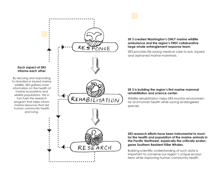
2. What is SR3 doing to address the problems: Rescue, Rehab and Research. How are they connected?
3. Real data that's action-driven that shows real impact. Eg: How many marine mammals are rescued till date?
Sketching and testing an infographic
We wanted to verify the identified need and visualization of the 3 R's. So we sketched out a few variations and took them to people to see their reaction. Since all the variations were very different in terms of structure, we were able to gather important feedback that informed our final design structure. Some of the key thoughts were:
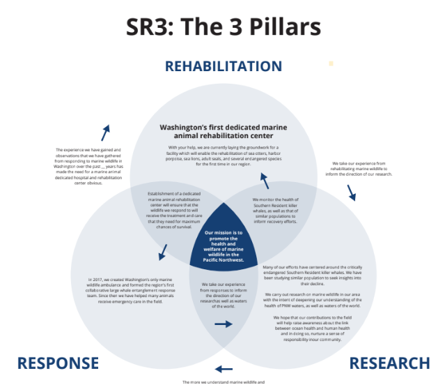
1. Venn diagram was the way to go, visually, since it tells a story of inter-connectedness without spelling it out.
2. People loved the use of icons to signify each of the 3 Rs and were generally more attracted towards the option with less text. However, they did like and even recommended having a secondary more detailed layer of interaction (Like a 'Click for more info') for those who are interested in gaining a deeper insight.
3. Does it matter if the 3 R's were connected? They seem important enough without being connected and the Venn diagram simply shows that SR3 gives equal importance to all 3 aspects, which is compelling enough.
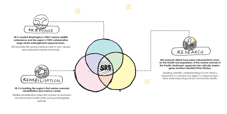
3R Infographic: Option 1
3 R Infographic: Option 2
3 R Infographic: Option3
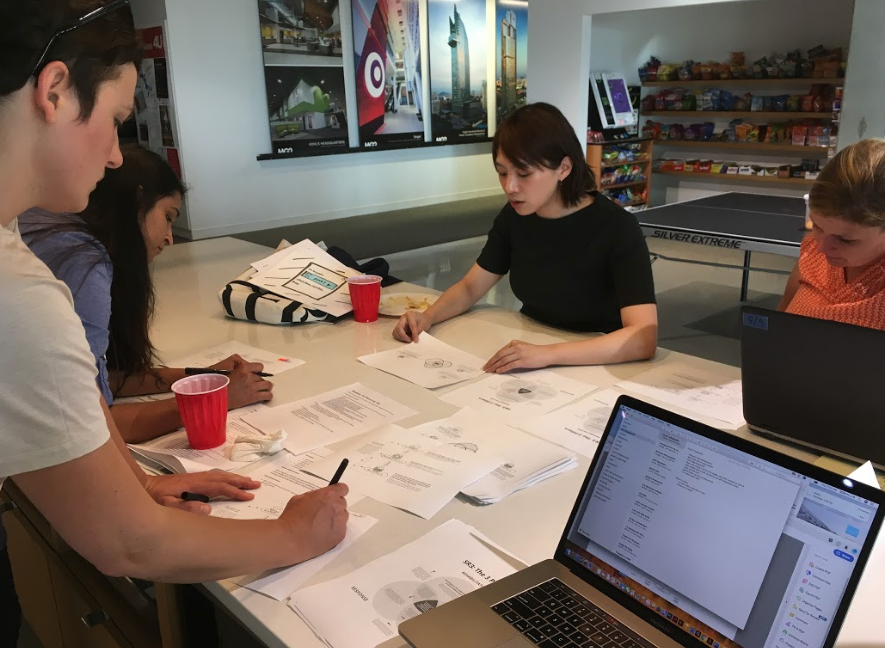
Testing the Infographic
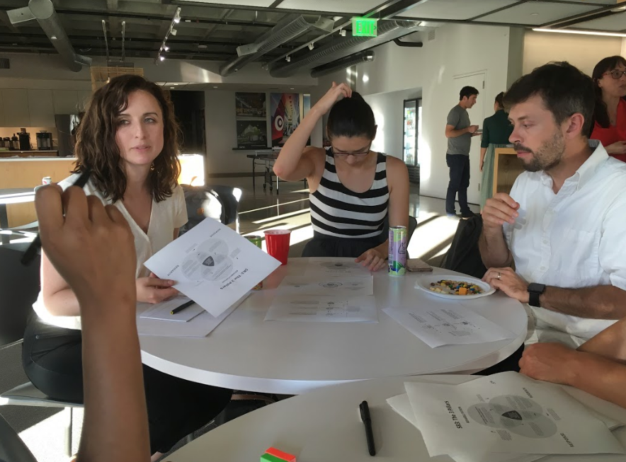
Testing the infographic
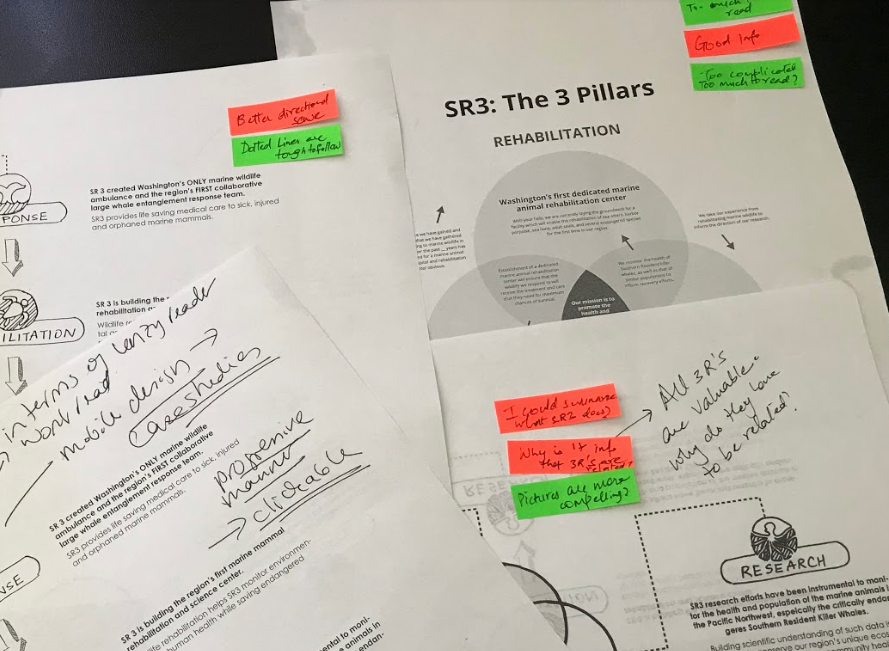
Analyzing the Feedback
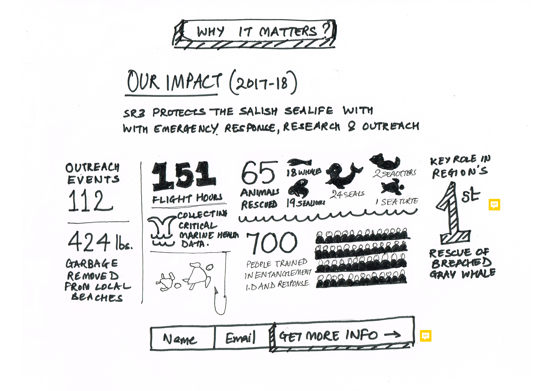
Landing Page Paper Prototype: Page 2
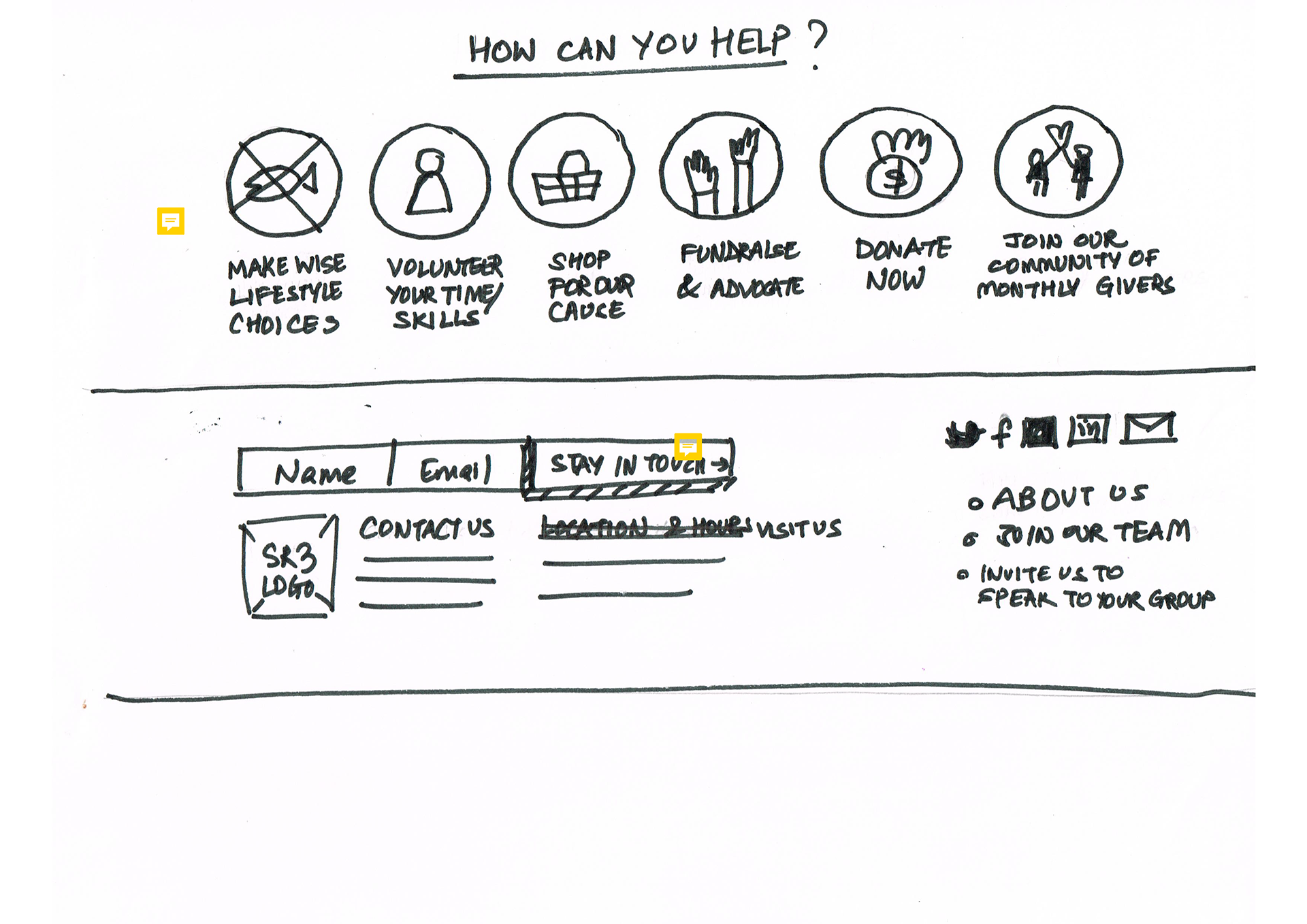
Landing Page Paper Prototype: Page 3

Testing the Prototype
Designing the final outcome
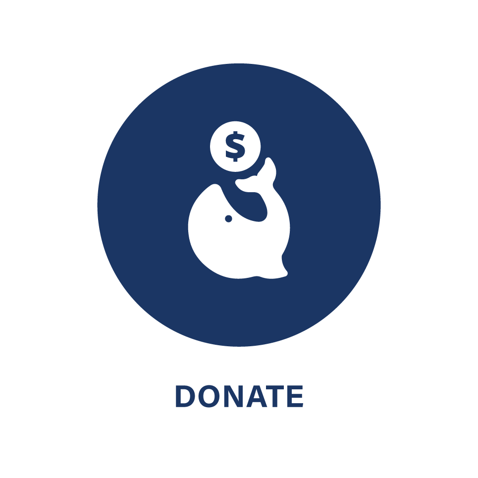
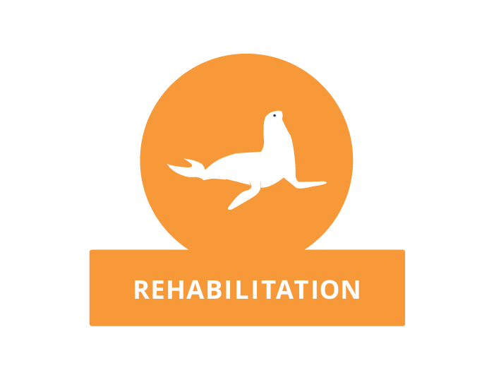
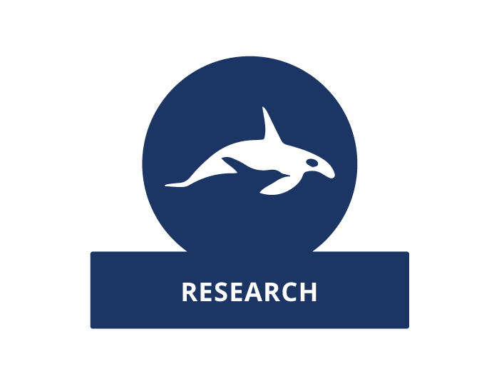
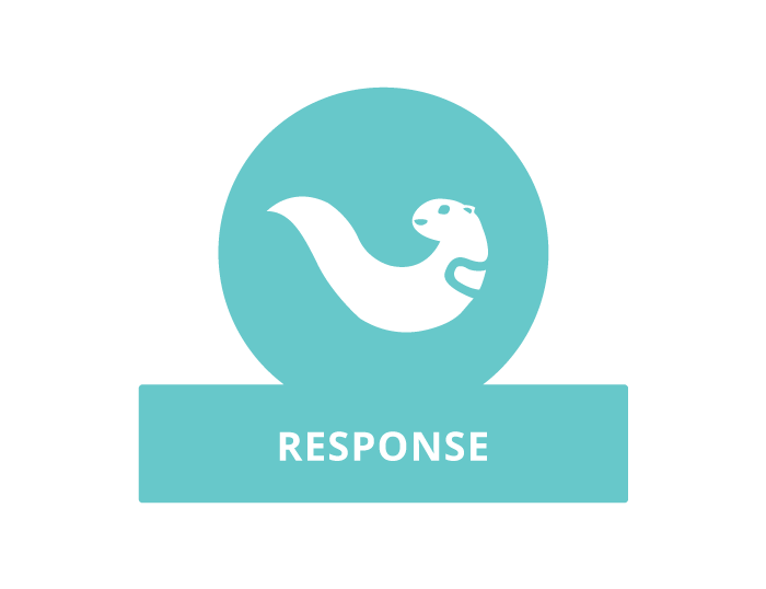
The final outcome includes a range of infographics that uses a solid color palette from SR3's current annual report (a small departure from SR3's logo and something the client liked and would like to take forward in all communications) and a mix of custom designed icons and illustrations of marine mammals.
Results:
The client is happy to receive important user insights that were not clear to them before this project and is excited to see the impact of all the new resources they have received from our team.
Their new hospital is already in construction stage and is slated to begin all functions by April 2020 and hence become the first marine mammal rehabilitation center in the Pacific North West. They are hoping to launch the newly designed website around the same time and a few of us from our team are excited to continue supporting SR3 by helping with website implementation.
We also hope to revisit SR3 later in 2020 to see how the new website and resources might have impacted their goal and impact.
