2021 | Samsung NEXT | Lead Designer
01. Discovery: Brand Sprint
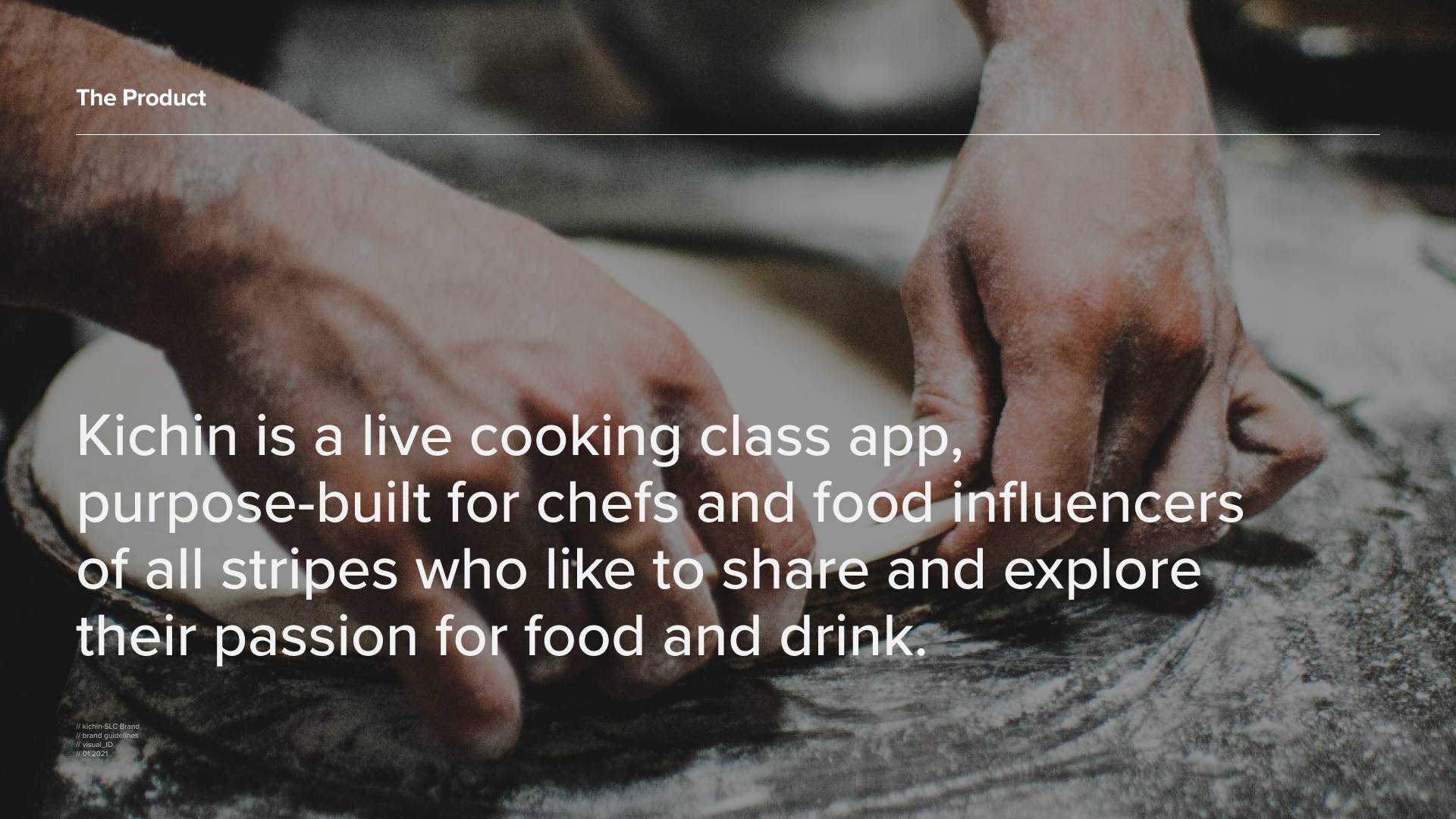
Our globally distributed team came together virtually with the objective of defining Kichin’s brand pillars and value proposition. Some of these conversations also helped inform key product features and user flow.
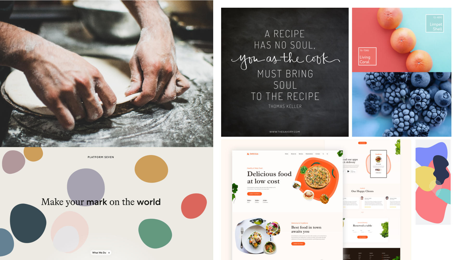
02. Word Play & Visual Exploration
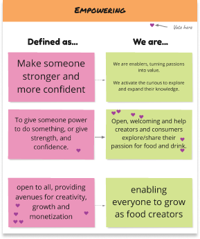
Empowering // open to all, providing avenues for creativity, growth and monetization
_organic growth, dynamic, celebrating imperfections
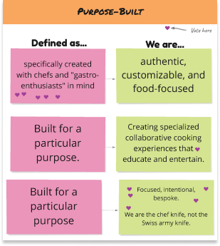
Purpose-built // specifically created with chefs and gastro-enthusiasts in mind
_highlighting the craft of cooking
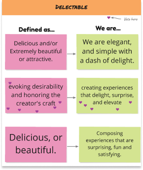
Delectable // evoking desirability and honoring the creator’s craft
_showcasing delicious food ingredients
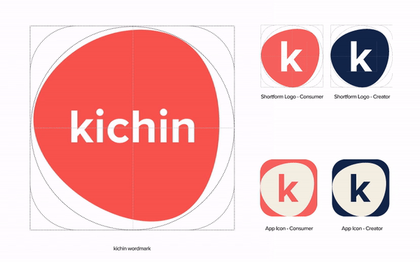
03. Logo Development
Each chef brings his own
personal touch and uniqueness
to a recipe.
Kichin’s dynamic word-mark, inspired by the craft of making pizza dough, celebrates each chef’s individuality and inspires organic creativity.
Kichin’s dynamic word-mark, inspired by the craft of making pizza dough, celebrates each chef’s individuality and inspires organic creativity.
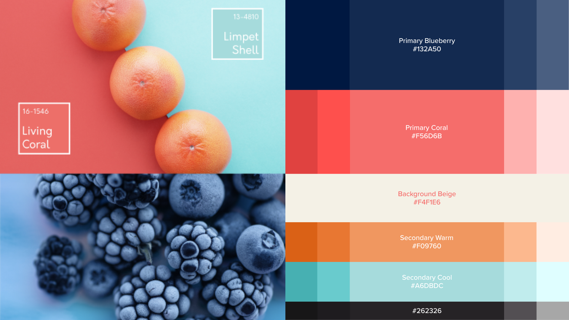
04. Colors
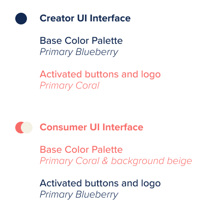
The colors are derived from fresh food colors that occur naturally. The coral and blueberry contrast well with each other and balance the overall harmony. The supporting secondary orange and blue are mostly used as highlights and the beige background soften the edginess of the otherwise saturated primary colors.
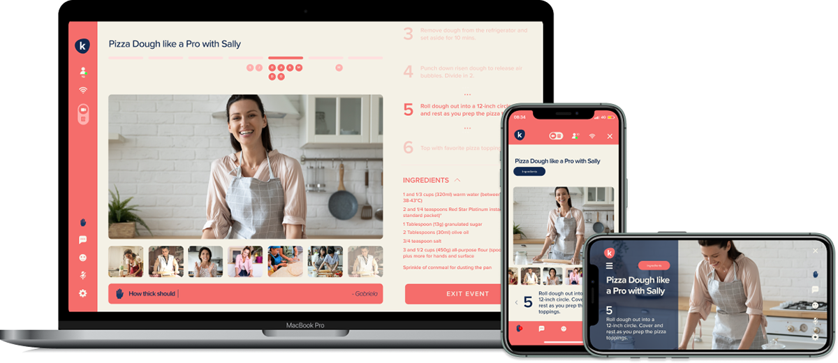
Since the kichin app has 2 audience profiles –the creator and the consumer– it made sense to use colors to differentiate the two interfaces.