Problem:
Most college graduates have one major thing in common: student debt. Today, 70 percent of college students graduate with significant amount of loans. Yet money matters for these folks are sometimes intimidating, boring and almost redundant keeping in mind their limited income. In a recent study, 84% of college students admitted that they need more education on financial management. They think it's a really important life skill to have a more secure and stable future.
How can personal money management skills be made more accessible, intuitive and relevant for young people?

MY ROLE:
This is a passion project, the roots of which lie in my early student days. It made for a good school project for my UX design class at General Assembly and while the research and prototyping was initiated back in 2014, I am still working on designing a mobile app that is informed from my learnings. My role on this is UX/UI designer.
VERIFYING ASSUMPTIONS:
I conducted a few interviews to verify my assumptions and get a peek into user behavior. I spoke to 14 NYU students ages 18-25. Here's what I found out about them:
•Too busy studying, working part time and socializing to prioritize money matters
•Most feel the need to start saving if there is a goal in site. For ex: An upcoming event/trip, An expensive gift (for self or another) etc.
•Most students maintain a ‘mental’ budget and adjust it as needed. Some use banking services like statements, online accounts etc. to keep track of expenses. Some practice ‘forced constraint’ and only withdraw what they need.
•Almost 90% have a part time job to make extra money. Yet only 20% are able to save any money at all
•At least 50% of them find money management intimidating and ‘not fun’
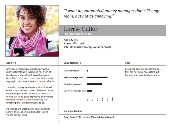
CREATING PERSONAS:
Based on my interviews, I created personas that best described my user's financial goals, spending & saving behavior, aspirations and pain points.
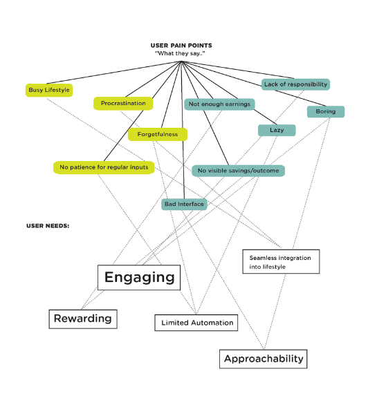
PAIN POINTS TO USER NEEDS
After identifying a few pain points, I translated them to possible user needs.
•Data safety and secure automation was a big theme. No one would trust an app that asks for personal financial info without seeing a thorough privacy policy and some kind of an endorsement by a trustworthy financial institution.
•Customizing in the form of enabling short term goal settings and recommendations based on real spending pattern.
•Intuitive and Smart in tracking expenses, goals and insights without a lot of manual input and logging
•Incentivizing by 'In-App' points for reaching goals, inviting friends and saving more each week/month.
•Engaging in the form of interaction by creating a game-like setup for tracking expenses against goals; social integration by allowing limited interactions with 'friends' and a real-time reward system for reaching goals and saving real money
THE FIRST ITERATION
• A tangible cash card that links to a mobile app and works & looks like a debit card.
• App is used to manage the card and primarily help set goals and a timeframe to track expenses made using the cash card.
• The tracking interface works like a game. User collects 'cookies' for achieving goals and 'stones' for 'overspending'. The goal is to collect more cookies and lesser stones to move to the next stage.
•The main idea is to make the app engaging through game play.
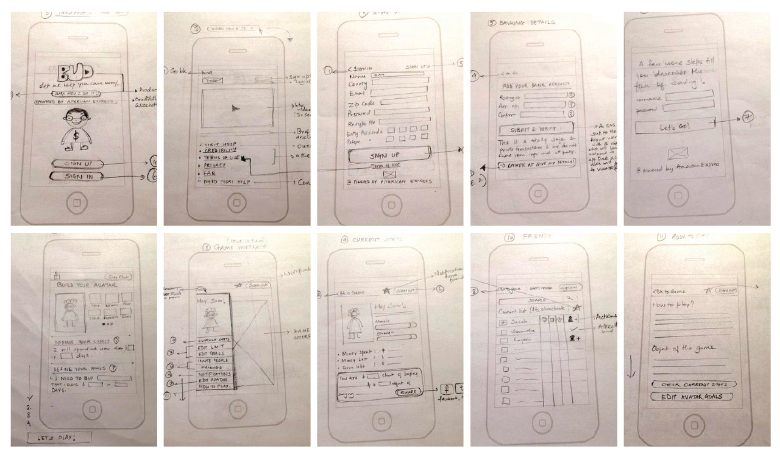
PAPER PROTOTYPING & NEW LEARNINGS
I created a quick prototype of this concept and presented to some of my users. And this is what came out of that:
Goal setting was a hit. Students really liked that they were able to set a budget and timeframe for a short term goal. They didn't even mind the many steps to ensure safety of financial information, and in fact, thought it was necessary and made them trust the app more.
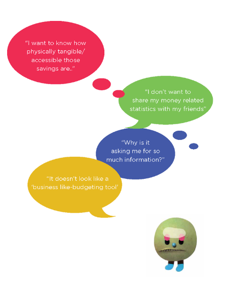
However, one of the major flaws of this concept was that students rarely used just one single form of payment. They sometimes use their debit card, sometimes cash and sometimes other apps such as venmo. They were also interested in knowing how tangible were these savings and does this app actually give them tips on how they could save money? It was a bit challenging for them to follow the whole purpose of this app and one of the biggest learnings for me was that contrary to my belief, students were more matured about this subject than I had foreseen and only 20% of them actually thought that the game play might make this app more engaging.
"..students were more matured about this subject than I had foreseen and only 20% of them actually thought that the game play might make this app more engaging."
THE SECOND ITERATION
Learning from this, I realized that may be the charge card is not the way. I need to think of this app as a one-stop-shop, collecting data on user's expenses from all possible spending channels. I had to rethink the functionality and the interface of the app so that it complements their maturity level and provides for their needs. I reworked the sitemap to focus on safety, goal settings, and a step by step walk through of how the app works. The tracker interface stayed, however, it was simplified to literally just act as a tracker and not an active game.
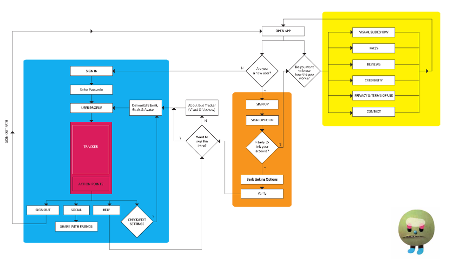
Information Architecture: Site Map
CARD SORTING
The next step was to test the information architecture of the app. I quickly identified 5 users to rearrange my post-it notes to see what makes most sense to them.
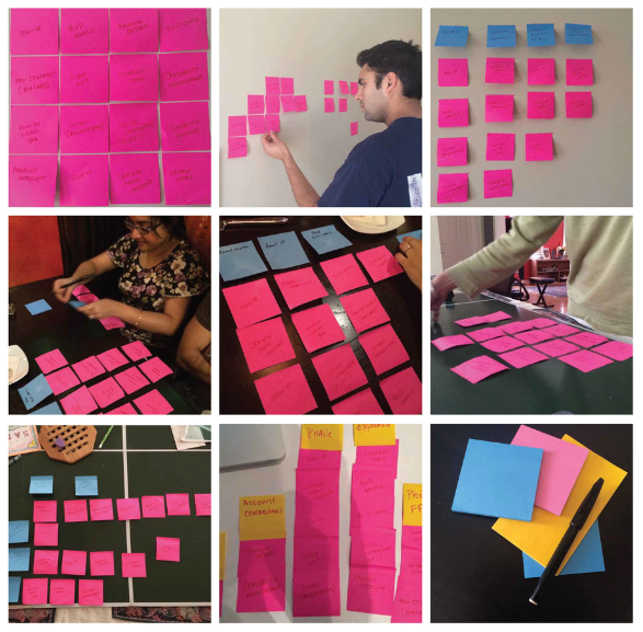
Card Sorting
LOW FIDELITY INTERACTIVE PROTOTYPE
Using my new found user insight, I decided it was time to have my users actually interact with a digital mockup. So I created an interactive prototype using Axure and focused on the following user flows:
•Safety Protocol
•Goal Setting
•User Dashboard
•Tracking interface
•Social media integration
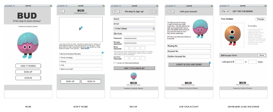
Low Fidelity Wireframe Using Axure - Part 1
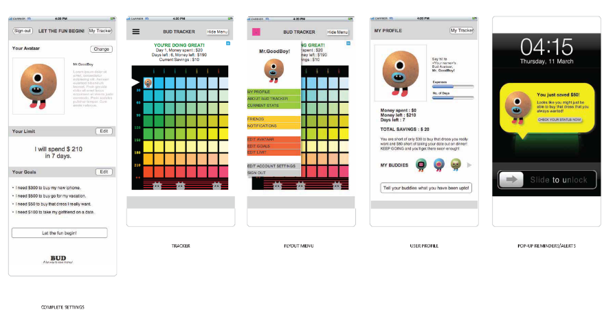
Low Fidelity Wireframe Using Axure - Part II
USER TESTING
I took this prototype to some more students at NYU and had them interact with it. Based on my learnings from this round of testing, here is a list of some specific updates to this app :
•The app on its own was doing most of the functions. As it seems, I am now considering if it even needs to have a tracking interface. Could that just be integrated into the user dashboard?
•Can the app propose tangible ways to save? A location based deal searcher might be the answer.
•Make the language work in a 'saving' context rather than 'spending' context. For example: I will save $$$ by the end of xx days.
•Users were not comfortable sharing actual numbers from their goals through social integration but they thought just sharing goals with friends might be good for some motivation. May be the social integration aspect needs to be optional.
•Users also need a real rewards system that would motivate them to save more money and work towards their goals faster. This could be done by enabling the user to collect In-App points for reaching goals, inviting friends and saving more than projected goals which can then be used to redeem real gift cards.
NEXT STEPS: UI DESIGN & HIGH FIDELITY PROTOTYPE
I am at a point where I now have a comprehensive list of content and functionality requirements of this app and feel ready to start working on the look and feel of the app. This would enable my users to react to this app holistically. The questions to ask will be - Are they able to relate to it? Does it answer their needs? Is it helping them change their attitude towards personal money management? More to come..
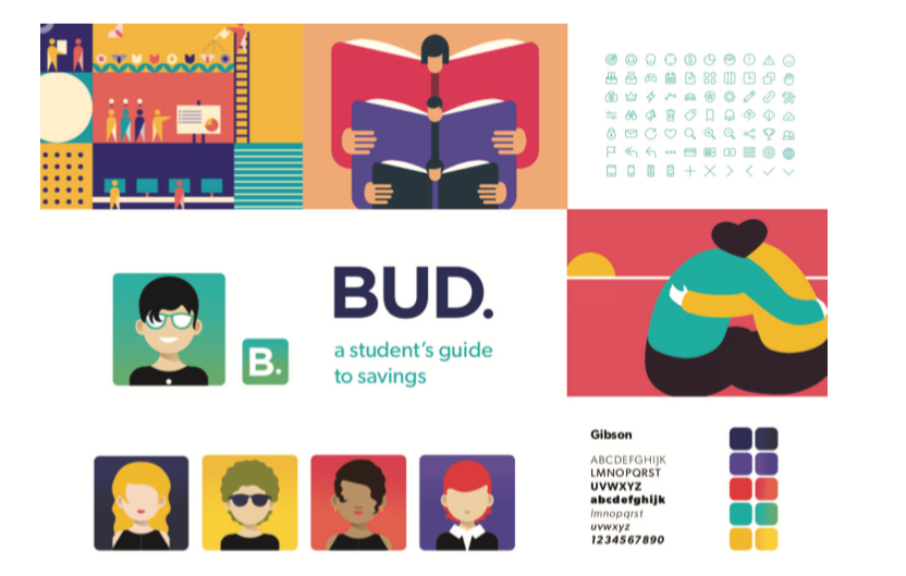
Interface Design Mood Board (Work in Progress)