01. PROJECT SUMMARY
The Microsoft Hololens Optics Hardware Team is a mix of highly distinguished optical engineers, and technical personnels
who are innovating everyday. It is a fast-paced environment where they have to ideate, present, pitch and implement on a weekly basis. The org itself is very complex with different teams managing development and deployment of different hardware components. All this complexity leads to a very complex web of schedules and presentations that needed to be visually streamlined so they are easily adaptable and identifiable.
who are innovating everyday. It is a fast-paced environment where they have to ideate, present, pitch and implement on a weekly basis. The org itself is very complex with different teams managing development and deployment of different hardware components. All this complexity leads to a very complex web of schedules and presentations that needed to be visually streamlined so they are easily adaptable and identifiable.
As a Sr. Visual and Presentation designer on the team, I was to design a comprehensive brand style-guide for a new presentation template system that could be used by designers and engineers alike. The main motive was to streamline a highly dynamic list of events and presentations so they are visually distinguishable yet part of an overarching brand system.
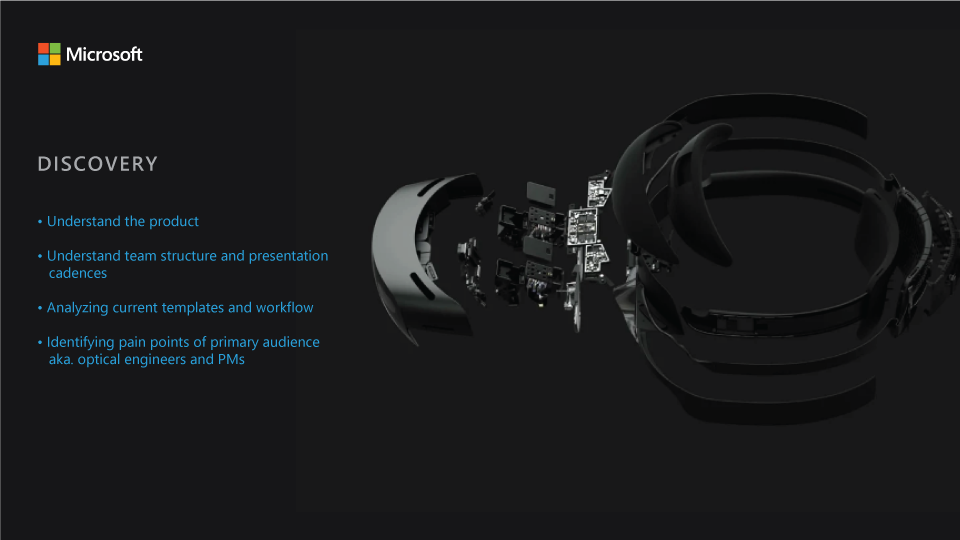
02. DISCOVERY
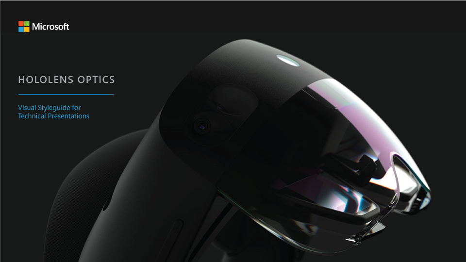
I usually start by understanding the product itself, in this case, the Hololens - how it functions? What parts constitute of it? How people use it? The next step is for me to understand what is my role on this team, which was to make sure all Hololens team presentations, internal and external, look beautiful, crisp and visually communicate a compelling story as well as the individual concepts that live within it.
For the Hololens Hardware Team, the technology I was dealing with is constantly evolving and is highly complex. There is a lot of ambiguity and a lot of unknowns - both within the technology and within the org. So after I got a satisfactory understanding of the Hololens technology, the org structure automatically started making sense. There were different departments for different hardware components and they had their own micro-teams and cadences.
By simply talking to the team members at various levels, I discovered challenges faced by them and the design team when using the existing template system.
“We don’t know which template should be used for what presentation”
“The existing templates don’t accommodate and give room for the tech content clearly”
“It would be nice to know in a glance which presentation belongs to which program”
“Since the slides are so content heavy, sometimes it’s hard to derive the real message”
“Can all visual assets be editable so we don’t have to rely on the creative team for small but important updates?"

03. DESIGN
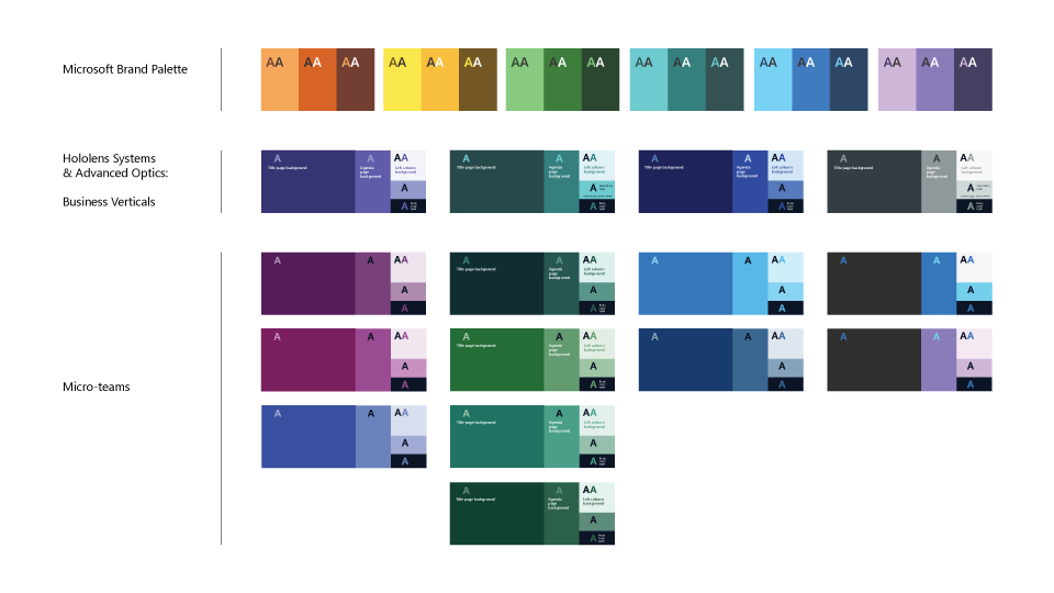
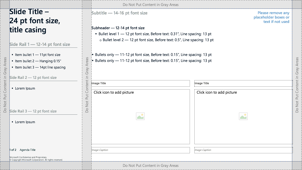
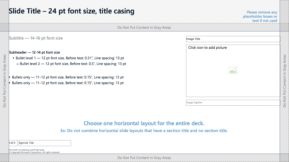
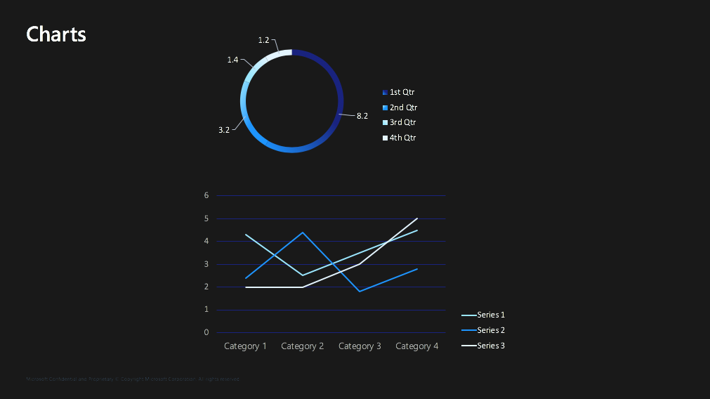
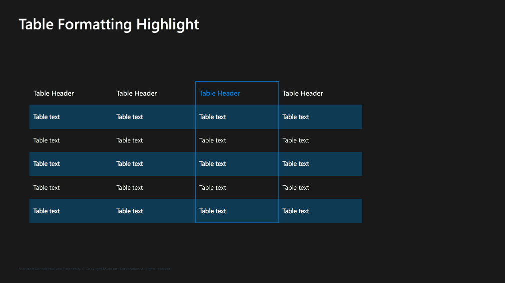
Keeping the requirements in mind, I created a flexible grid that would lock-in the space usage within slides. This grid system would extend into all the presentations so that even if slides were pulled in from various sources (which they often were), they all followed the same grid and the subsequent design formatting would be minimal. Next, I created a comprehensive color and design system that was flexible enough to accommodate a dynamic org structure. I used colors and easy-to-reproduce linear, abstract graphics to distinguish different meeting series under different programs.


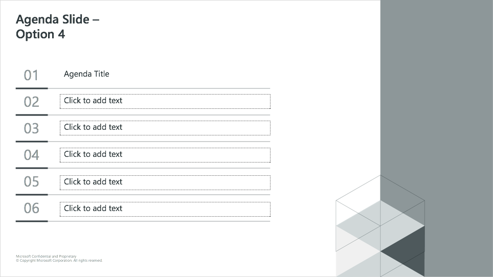
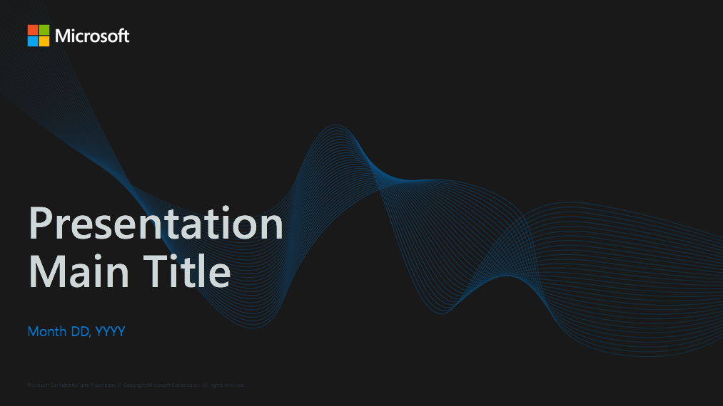
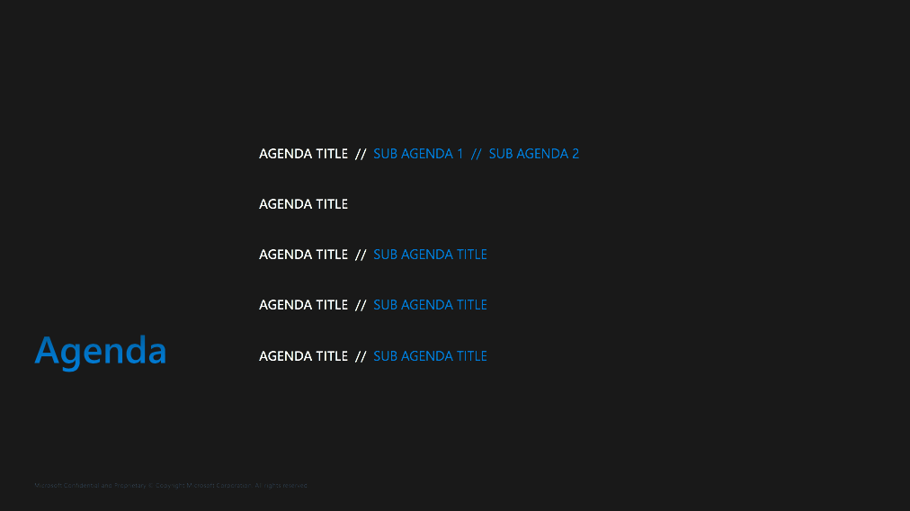
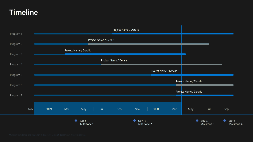
Weekly Presentation Template
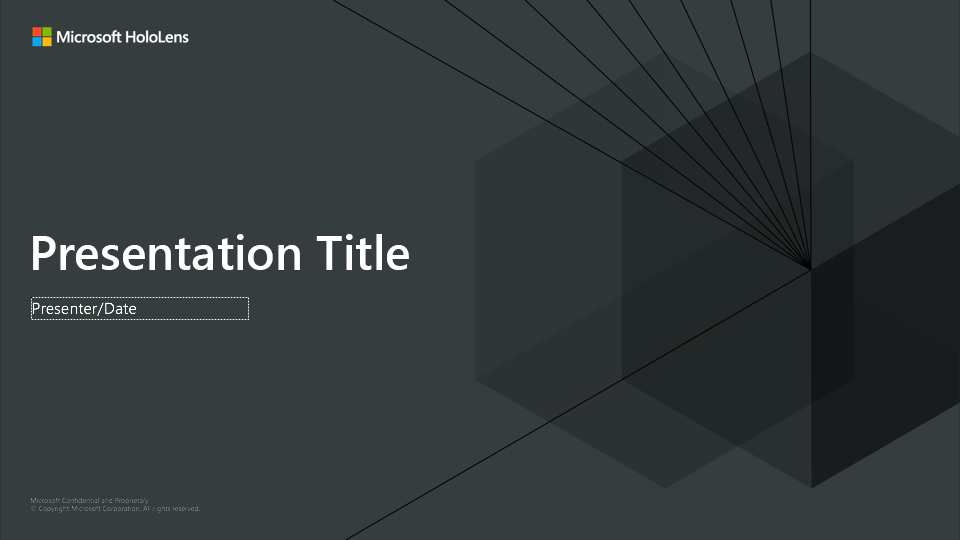
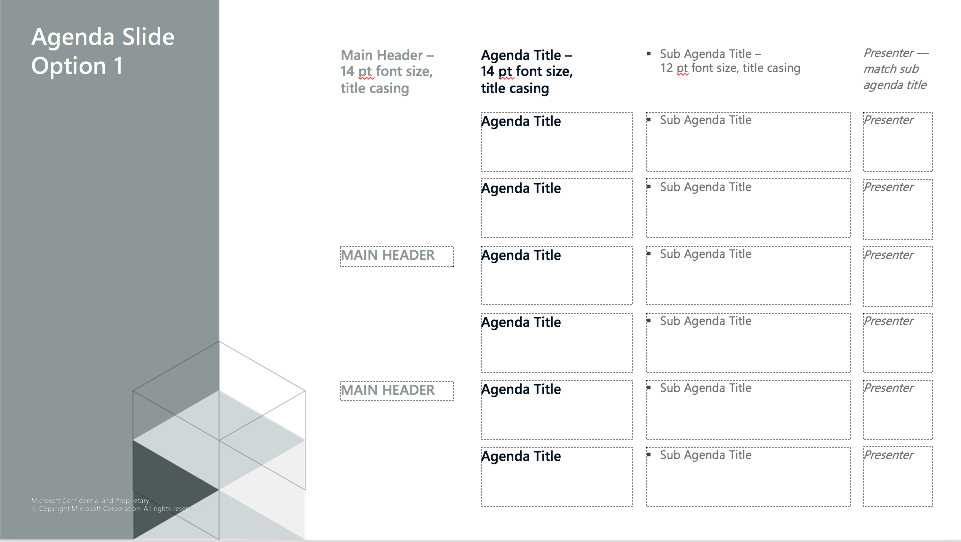
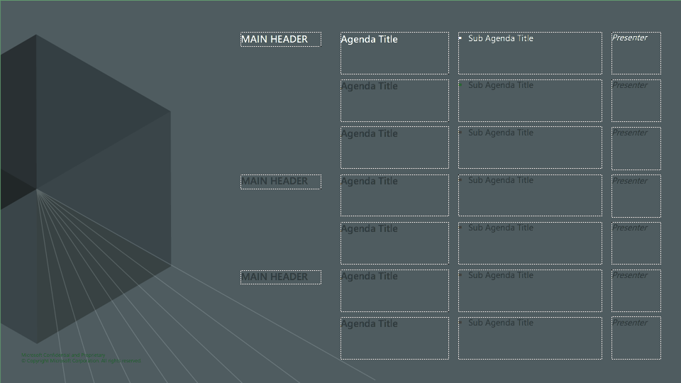


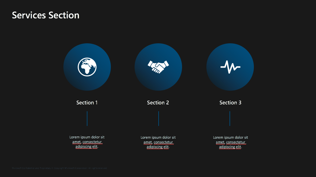
Milestone Presentation Template


04. TESTING
Derived from this system, I created a fully fleshed out template that would be used for a weekly recurring presentation. In collaboration with the owner of the presentation series, I had the entire engineering team use that new template design to put together week 1 presentation. The team was confused with the change, but were quick to adapt and follow through. I took note of questions I was asked while they populated the template with content and I sat through the final technical presentation to see what they saw and how they saw it. This process gave me a good understanding of some of the template settings, typographical errors, legibility and accessibility issues, as well as color discrepancies. I took those learnings and made adjustments to the template used for the next weekly presentation and so forth. The good thing about choosing weekly presentations for testing this template system was that I was able to test the usability and design in real time, through observation and presentation, without actually using extra time of the engineers to ask them for verbal feedback. I strived to get to a point where the design itself is completely unobtrusive and invisible and the engineers are able to use and work with it seamlessly.
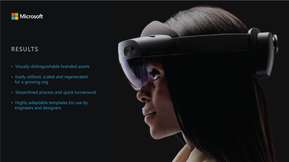

05. RESULTS
The visual system I created at the Hololens Advanced Optics team helped the entire team streamline these presentations into visually distinguishable, branded assets that could be utilized, scaled and regenerated for a long time to come. There were at least 3 new designers and many more tech hires after these templates were created and they were easily able to improvise, expand and own this template system.