
01. PROJECT SUMMARY
The Center for Reproductive Rights operates with a very strict brand design system to ensure consistency across media. Like many other aspects of the website, the Gala page was already templated to avoid the process of reinventing the wheel each year. So the challenge was to re-design the webpage staying within the time and brand constraints.
The easiest and quickest solution would have been to simply replace the info from previous years with that of the current year. Following a quick check on website analytics, there was a significant increase in recent mobile visitors than the previous years. But it was quickly realized that the webpage template from the previous years were not optimized for mobile viewing. See below a screenshot from previous year's gala webpage.
02. INTUITIVE, DATA DRIVEN PROBLEM IDENTIFICATION
After the first briefing, my instinct was to open up the site from last year on my phone. What I noticed were the following 3 things:
• Call to Action was too small
• Bios of the honorees lived on a separate page that would make the user wander off the main page with the CTA
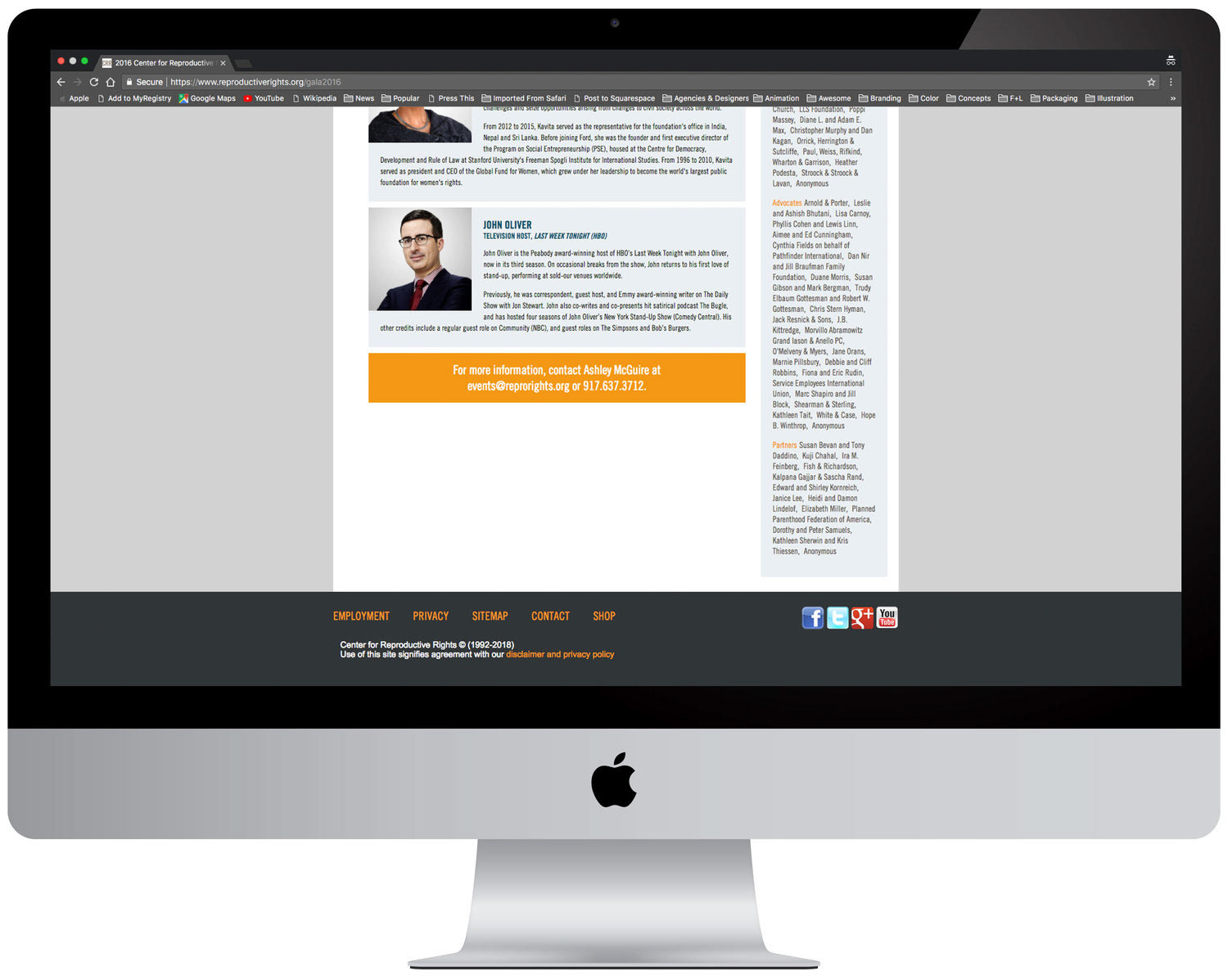
•. The Design was not optimized for mobile users
• 63% of website visitors were using mobile devices
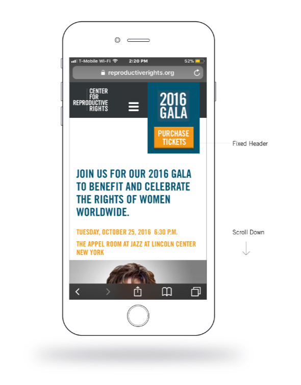
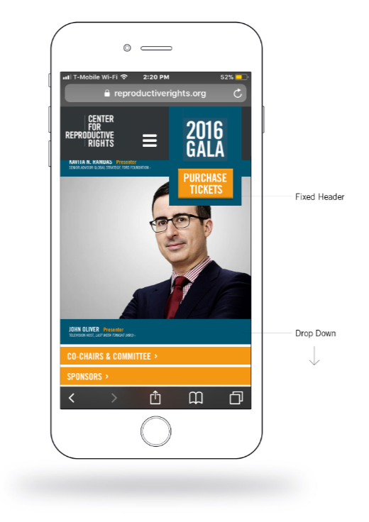
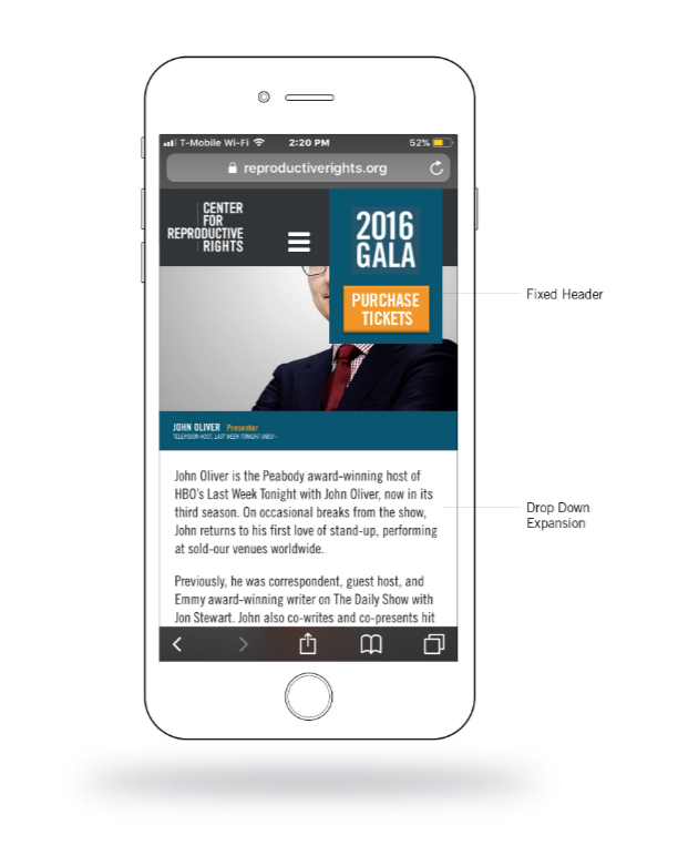
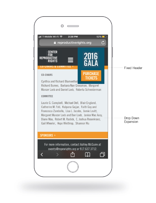
• The 'Purchase Ticket' link was made large and part of a fixed header that made the Call to Action always accessible and easy to click even on a small mobile screen.
•. Simple collapsing drop-downs were used to display honoree bios to keep the site from looking too cluttered.
•. Keeping all the content on a single scrollable page kept users focused on the task at hand and prevented them from wandering off to another page.
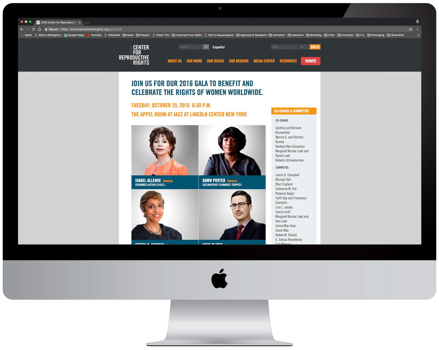
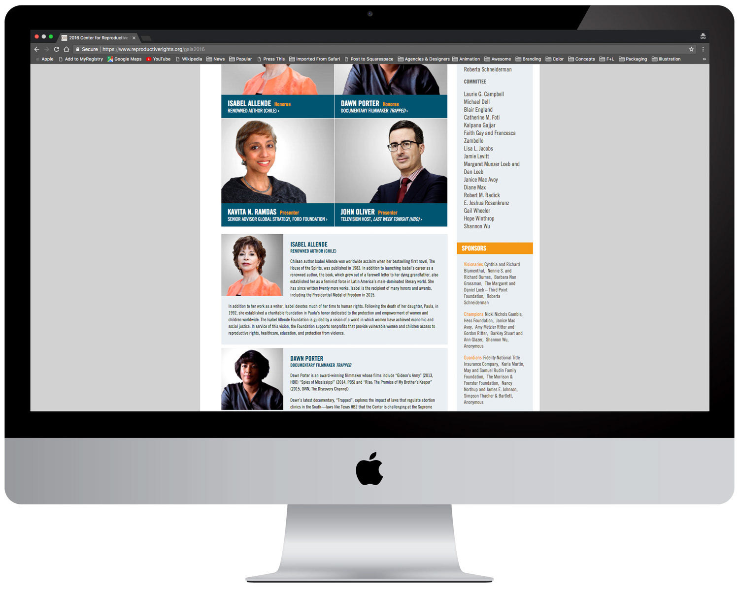
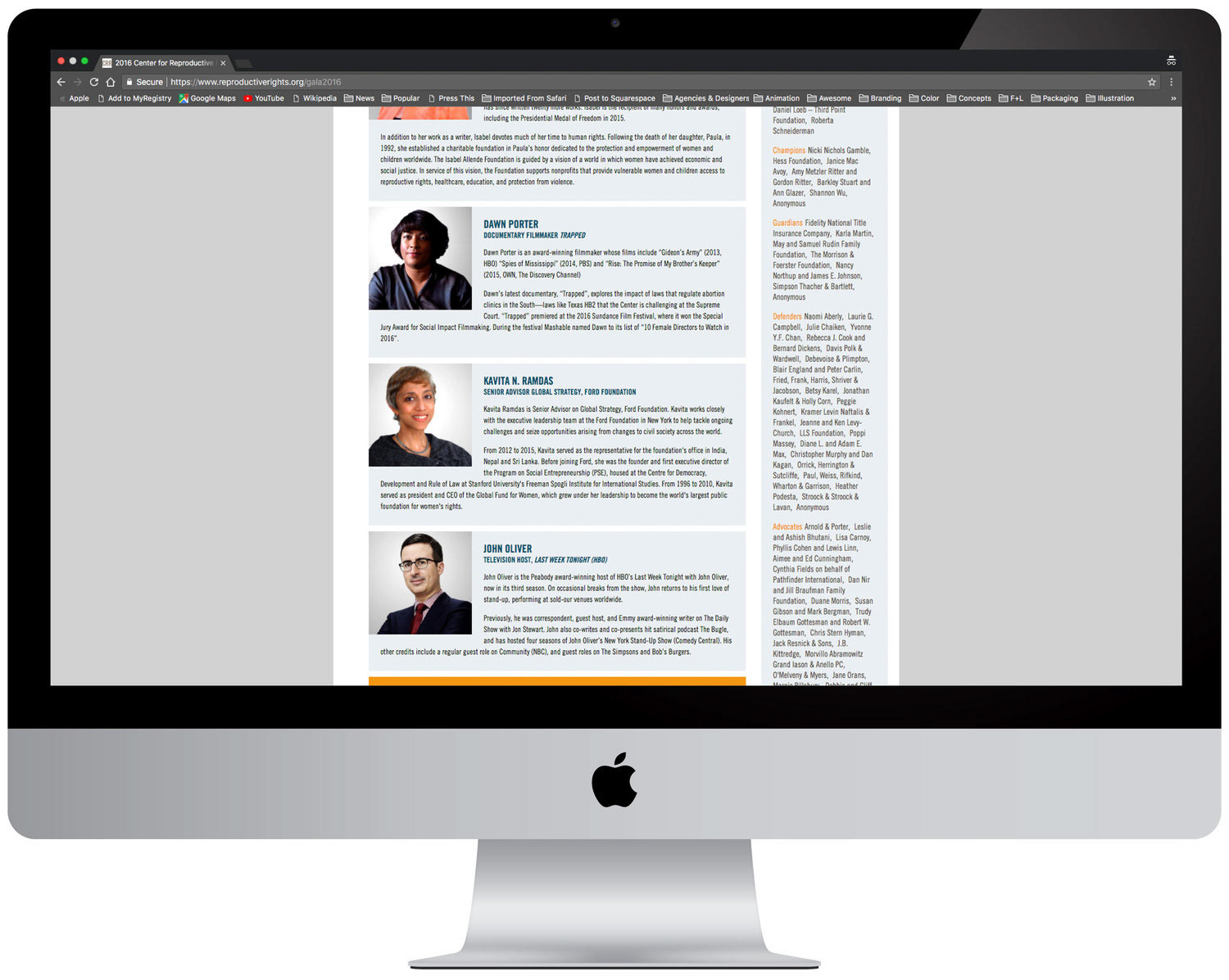
•. The mobile site was easily translated into desktop version without looking starkly different from the brand template.
04. RESULT:
• Significant increase in ticket purchases through mobile phone.
• A system that inspired a site-wide design overhaul.