PROBLEM
As a 30 something working in downtown Manhattan for many years, I realized and lived through the classic lunch time dilemma. And I wanted to verify if I am the only one. I went ahead and conducted a survey on ages 22-45 working in major metropolitan downtowns such as New York, Chicago, San Fransisco, Seattle and Portland. As it turned out, a sizable percentage of them were 'trying to eat healthy' and stay fit. During lunch, they would take a walk to a close-by salad bar but were almost always met by frustrating long lines. Ordering online everyday would also lead to a lot of waste of time and efforts and eventually would not even get them a healthy meal.
How can we design an experience of ordering a fully customized healthy meal plan and remove the fuss of placing a lunch order everyday?
PROJECT SET UP & MY ROLE
An end-to-end web application solution including service conceptualization, research, strategy, IA, UX and finally the UI components. This was the capstone project of my UX specialization on Coursera. This user experience is designed to order fully customizable and healthy meal plans online for people working in downtown metropolitans. I was the UX/UI designer for this project and my tutor and peers were my advisories for this project.
CONCEPTUALIZING SERVICE
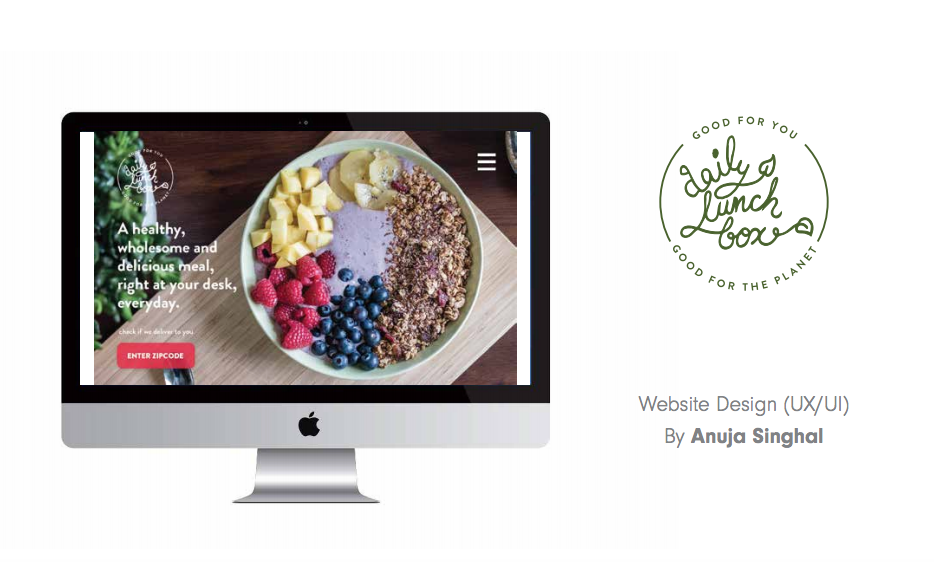
I began with conceptualizing a delivery-only restaurant that was based out of Portland, Oregon. My choice of location was based on the percentage of 'healthy food seeking' individuals in a city. I came up with a name, a domain, a menu, fair pricing and an elevator pitch for my restaurant. I called it 'The Daily Lunch Box' and the idea was to have this restaurant deliver fresh, farm to table, sustainable and wholesome lunch to your doorstep. You can fully customize your meal based on the basic building blocks of a healthy meal and be rest assured that what you are consuming is actually good for you.
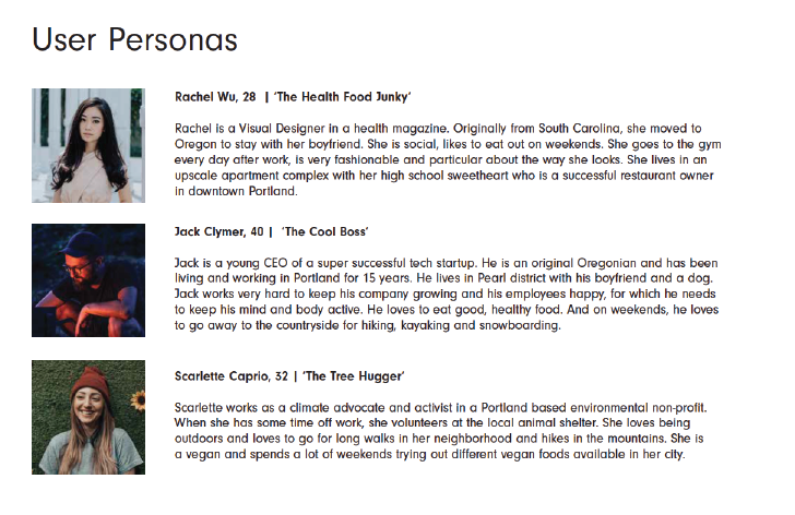
UNDERSTANDING MY TARGET AUDIENCE
Next step was to specify roles, demographics and psychographics of my target audience. I was talking to the executive level, environmentalists, designers and activists of the world who care about themselves and the environment. I created user personas based on this profile. And then identified user needs and client goals based on the personas.
DEFINING USER NEEDS AND CLIENT GOALS
My users wanted a service that could provide them with fully customizable, healthy, wholesome and sustainably sourced meals. They wanted these to be delivered fresh and quick. They wanted to know if the restaurant delivered to their area and they wanted to not stress about ordering lunch everyday. The service itself aspired to become a go-to office lunch resource for healthy and sustainable food and also to create awareness about healthy eating habits.
CONTENT AND FUNCTIONALITY REQUIREMENTS
As per user needs and client goals, I made a comprehensive list of content and functionality requirements that would define the way the app works and the purpose it serves.
Content Requirements:
• Service descriptor
• One time meal menu with descriptor
• Meal Plan scheduling and menu with descriptor
• Image+Text about source of food
• About Us Page
• Blog
• Testimonials
• FAQs
Functionality Requirements:
• Zipcode text field to check delivery options
• One time delivery or meal plan?
• Customize meal and active plate graphic
• Meal plan scheduling
• Progress bar
• Cancel/Edit meal plan
• User account
• Write testimonial
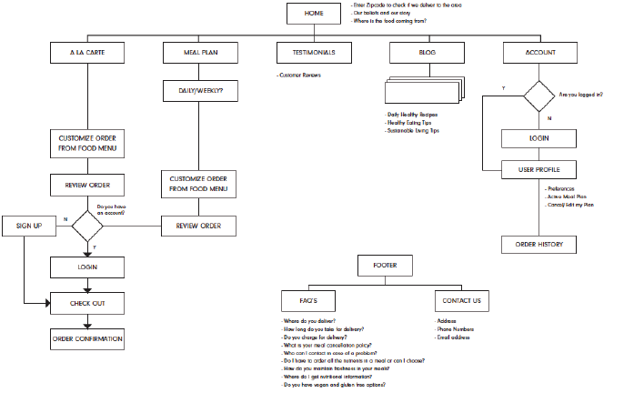
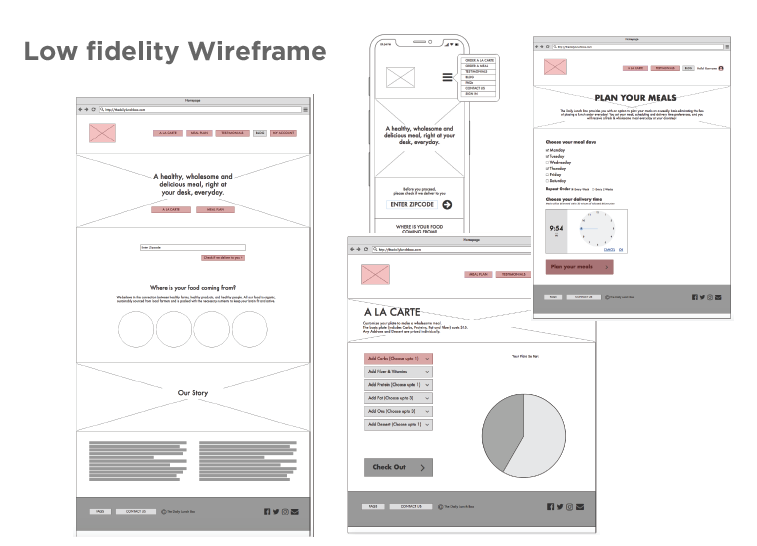
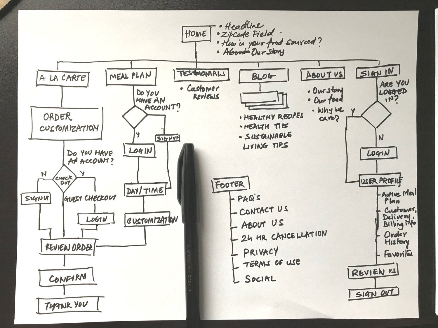
SITEMAP & WIREFRAME
The next step was for me to create a site map that would lay all the the requirements and content in an easy to follow and intuitive structure. I took the site map and created a low fidelity wireframe to test it with actual users and see if the user flows through it smoothly. In the process, I also created a mock up for what the wireframe might look like on a mobile device.
USER TESTING & LEARNINGS
I took the sitemap and the wireframe to perform first-click testing online. Basically, I proposed users to perform a specific task on the wireframe and observed how they flowed through it - what paths they chose, where did they get lost, and how easy was them to find a way to complete those tasks.
As per my testing results, users were able to identify the correct path 80% of the times. However, the area of failure was glaringly evident. I noticed that the meal cancellation policy and function was not very clear. Users struggled with that task and ultimately only 20% of them were even able to find a resolution. Also the zip-code had to be very front and centered, since we didn't want to the users to go through the ordering process only to find that the restaurant doesn't deliver to them.
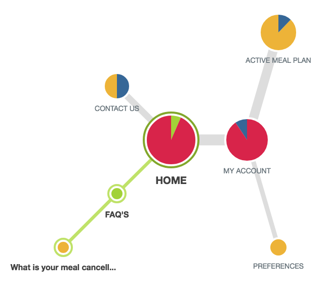
Back to the drawing board: Revised Site Map
BRANDING
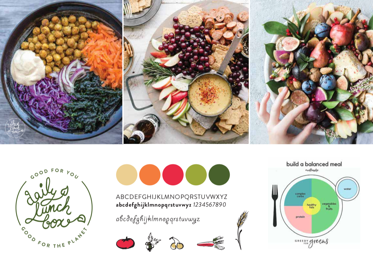
User testing was followed by making necessary tweaks in the wireframes and diving straight into creating the look and feel of the website which included establishing a brand identity, color palette, type treatment and photography.
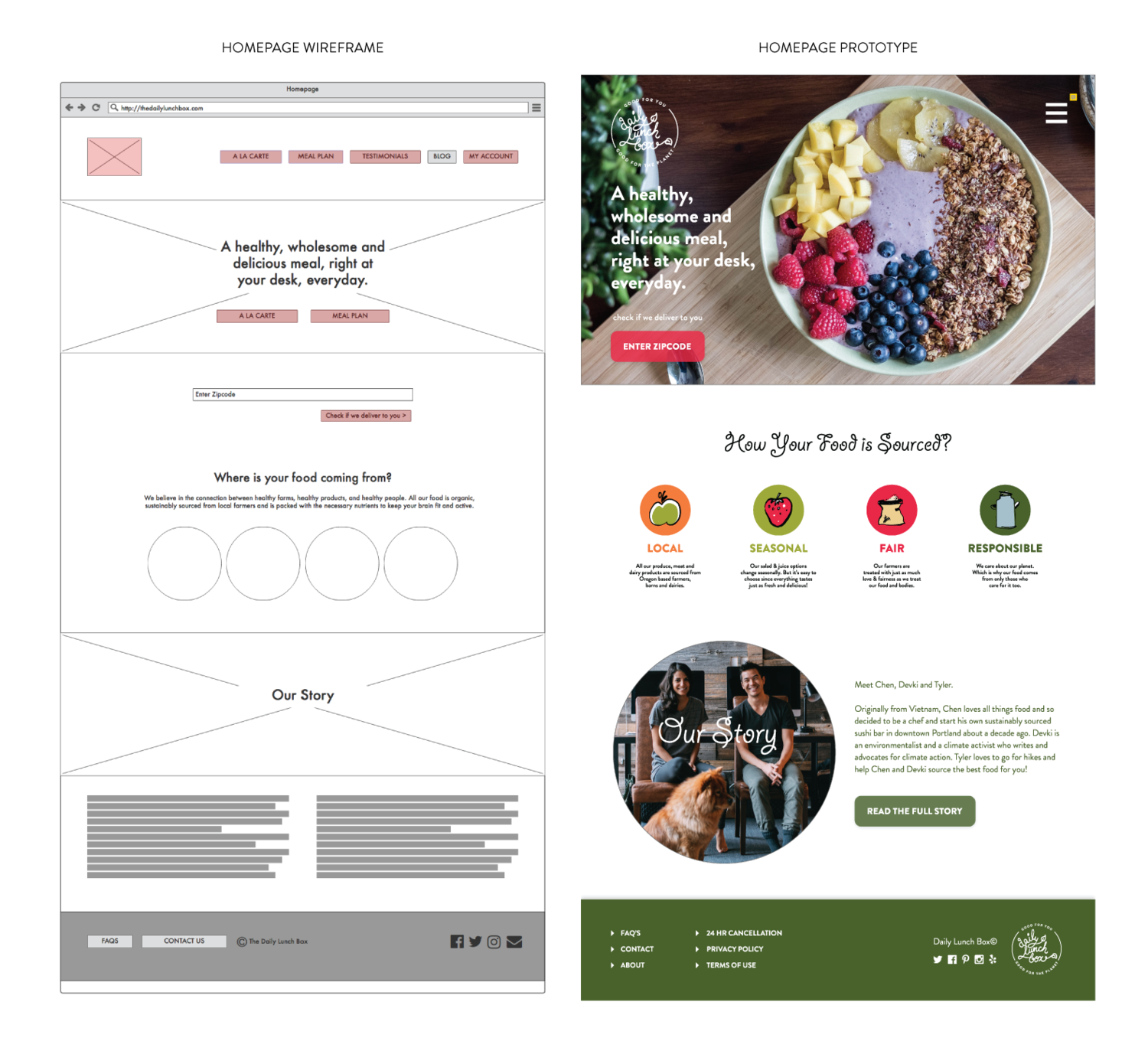
FROM WIREFRAMES TO HIGH FIDELITY PROTOTYPES:
The following was the development from wireframe stage to prototype. As you notice below, the header menu bar finally got collapsed into a hamburger menu on the right so the image of food gets more real estate. Also a few changes were incorporated in terms of the placement of the Zip-code field since that was the first thing we wanted the user to check before browsing the rest of the site. Footer items were also added to tackle a few details that were previously missing.